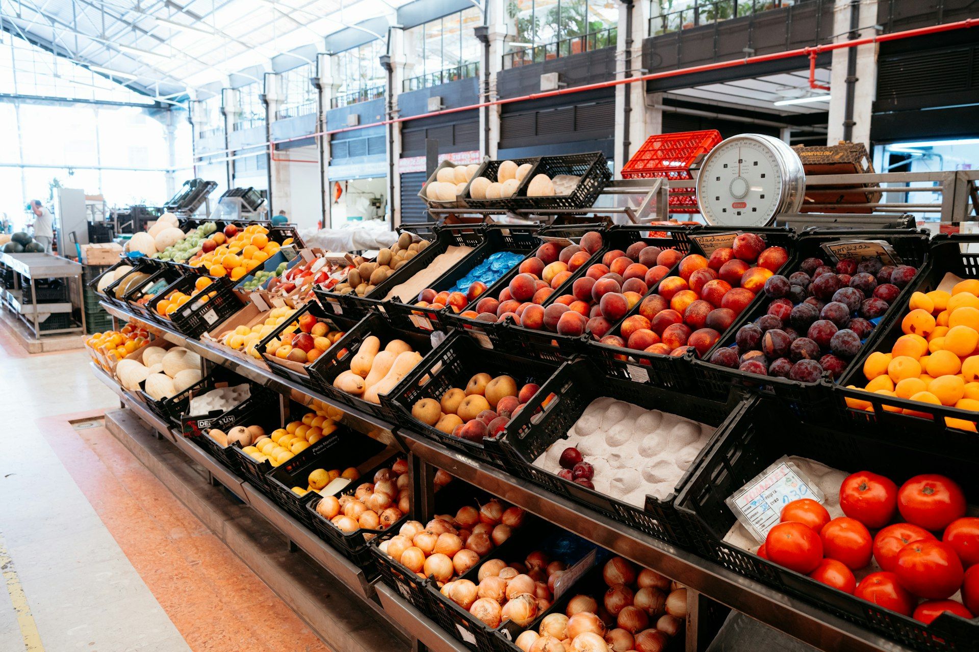
Walk into almost any supermarket and the floor plan feels accidental: produce up front, dairy in the back, a maze of boxes in the middle. It is not accidental. Grocery store layout is a sales system, and ultraprocessed food usually wins the best real estate.
That does not mean you need a conspiracy theory or a cart full of self-denial. It means you can see the nudges—endcaps, eye-level shelves, checkout candy—and shop around them. The goal is a cart that matches your list, not the store’s margins.
Why do grocery stores put junk at eye level?
Retailers and brands have long known a blunt rule: eye level is buy level. Products placed where your gaze lands first sell more than products tucked on the bottom shelf or pushed to the top. Premium placement is often paid placement. Big brands with marketing budgets buy the height your eyes hit first; smaller brands and store brands frequently sit higher or lower.
In cereal and snack aisles, the pattern gets sharper. Bright packages aimed at kids often sit at a child’s eye level—or at the height of a kid riding in the cart. Adults scanning quickly still grab what is easiest to see. Convenience is not neutral when the easiest thing to see is the most engineered food in the store.
Looking one shelf up or one shelf down is a small act of resistance. So is reading the unit price instead of trusting the face of the box. The store is designed for speed. Your list is designed for intention.
What are endcaps really selling?
Endcaps—the displays at the ends of aisles—are some of the most valuable square footage in the building. Shoppers pass them whether they enter the aisle or not. Color, signage, and “special” framing pull attention even when you are on a mission for eggs.
Here is the part many people miss: an endcap is not automatically a bargain. It may be a true sale, a new product push, a clearance dump, or a paid promotion. Ultraprocessed snacks, sugary drinks, and seasonal candy show up here constantly because they are high-margin and easy to impulse-buy.
Treat endcaps as ads with legs. Glance if you want. Put nothing in the cart until you check the price against the same item on the regular shelf—and against whether it was on your list at all.
Why is the checkout lane full of candy?
By the time you reach the register, your decision fatigue is high and your willpower is tired. Checkout is a captive corridor. Everyone passes through. That makes it ideal for small, high-margin impulse items: candy, gum, sugary drinks, salty snacks.
Observational research on California store checkouts found that most food and beverage facings at checkout were candy, gum, sugar-sweetened drinks, and similar snacks—while water and produce were rare. Healthy-checkout policies in some cities exist precisely because the default lane is so skewed.
England has even restricted placement of many high-fat, sugar, or salt products in entrances, end-of-aisle displays, and checkouts in larger stores. The policy exists because location is a form of marketing. When governments regulate shelf geography, it is a clue that geography was never innocent.
Practical move: choose a lane with fewer grab-and-go sweets when you can, or use self-checkout with your eyes on the screen instead of the rack. Better yet, finish the list before you enter the queue so the last five minutes are logistics, not temptation.
How do you shop the perimeter without becoming a martyr?
“Shop the perimeter” is useful advice that gets turned into a purity contest. Produce, meat, dairy, and eggs often live on the outer ring. Center aisles hold most of the ultraprocessed packaged goods. That map is roughly true—and incomplete.
Olive oil, beans, rice, oats, frozen vegetables, and canned tomatoes live in the middle. Those are not junk. Martyr shopping—refusing every center aisle—makes healthy eating feel brittle. Smarter shopping uses the perimeter as home base and treats the center as a purposeful detour with a short list.
Try this instead:
- Write the list by zone. Produce first, then proteins, then a short center-aisle run for named staples only.
- Eat before you shop. Hungry carts buy louder packaging.
- Decide snacks at home. If crackers are allowed this week, put a brand and size on the list so the endcap cannot invent the decision for you.
- Use frozen and canned on purpose. They are often more nutritious than the “fresh” impulse bakery near the entrance.
- Ignore the theater. Sampling stations, seasonal towers, and “limited time” bins are designed to break your path. You can walk past.
You are not failing if you buy pasta. You are failing the store’s plan if you buy three unplanned ultraprocessed items because they were impossible not to see.
What counts as ultraprocessed—and why placement matters
Ultraprocessed foods are typically industrial formulations with additives you would not use in a home kitchen—emulsifiers, artificial flavors, hydrogenated oils, and long ingredient lists built for shelf life and craveability. They are cheap to make at scale, travel well, and respond beautifully to marketing. That combination earns them the best shelves.
Whole foods need less advertising. An apple does not get a cartoon mascot. A bag of chips does. When promotions, eye-level slots, and checkout space skew toward discretionary ultraprocessed products, the store environment quietly trains the cart.
You do not need a perfect diet score to push back. You need a list, a slower glance at eye level, and a habit of questioning anything that appears in three places at once—shelf, endcap, and checkout fridge.
A calmer way to win the aisle
Supermarkets are not evil. They are businesses optimizing for sales. Your job is not to lecture the store. Your job is to refuse free marketing inside your own cart.
Start with one trip. Shop produce first. Skip two endcaps. Put one candy bar back at checkout. Notice how much of the “want” was placement, not preference. Then repeat until the layout is visible—and less powerful.
The cheapest upgrade to your grocery run is not a new diet app. It is recognizing that the floor plan is a pitch—and walking through it like a person with a list.